The Ricoh GR IIIx high contrast black and white settings start with the built-in Hi-Contrast B&W Image Control, then use the Fn adjustment screen to tune contrast, sharpness, and grain. A practical starting point is Contrast +4, Sharpness +4, and Grain Effect 3. The result is a punchy monochrome JPEG with deep shadows and bright highlights, ready to use straight from the camera.
What Hi-Contrast B&W does on the GR IIIx
Hi-Contrast B&W is a built-in Ricoh Image Control designed to create a gritty, dramatic monochrome rendering in-camera. It is useful when you want a decisive black-and-white look in the JPEG itself, rather than a neutral file to shape later.
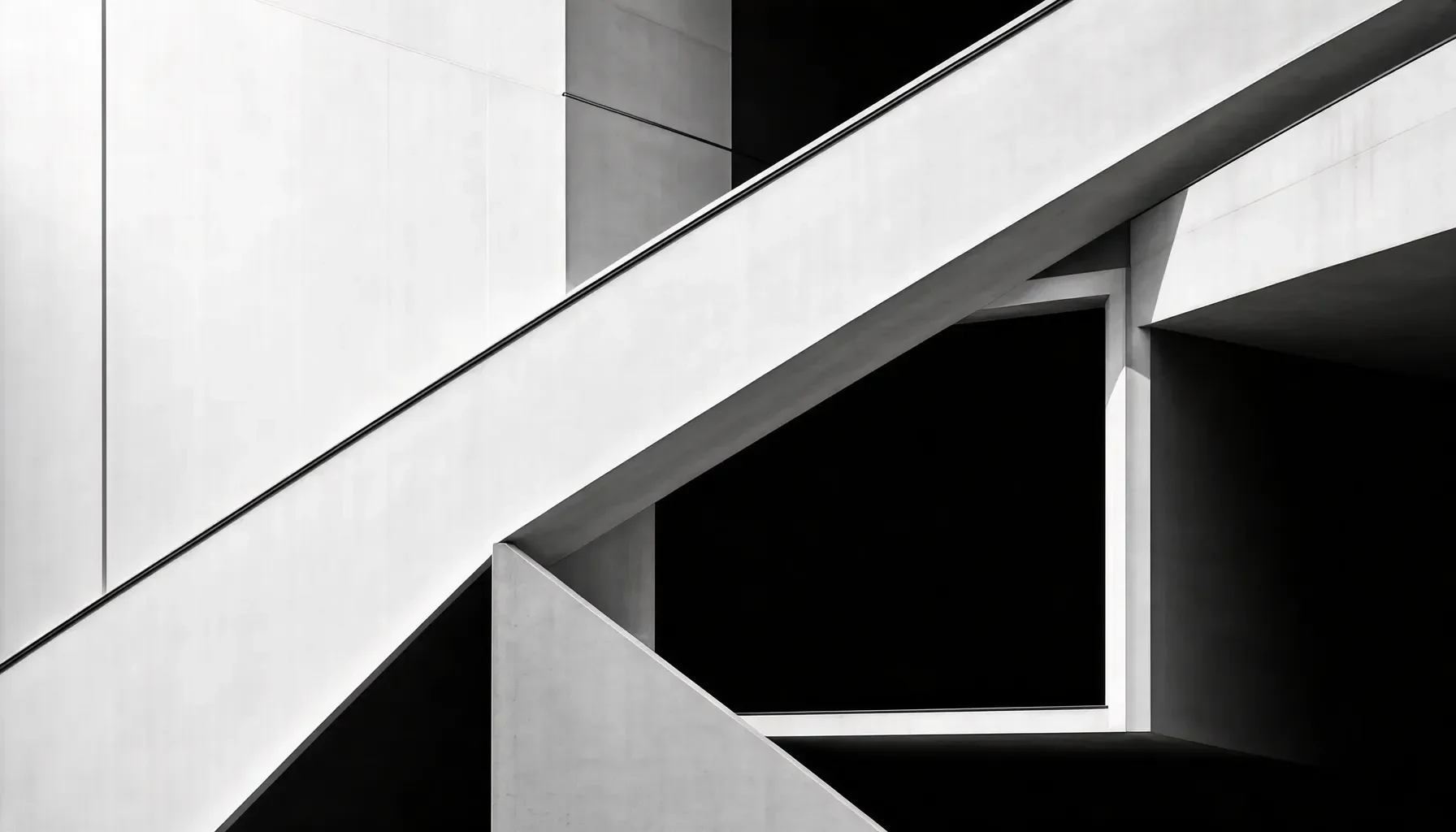 Ricoh GR IIIx High Contrast Black and White Settings - What Hi-Contrast B&W does on the GR IIIx
How this Image Control differs from other monochrome modes
The GR IIIx’s Image Control options determine how the camera processes JPEG images. Hi-Contrast B&W is designed to push tonal separation: highlights can appear bright, while shadows become deep and dense. That gives it a more forceful character than a restrained monochrome rendering.
It is not simply a color image with saturation removed. Its high-contrast treatment is the point, so it can simplify a busy scene into strong areas of light and dark. The trade-off is reduced subtlety in shadow and highlight detail. If a scene depends on delicate midtones, this look may be too aggressive; if it depends on graphic shapes, it can make the composition more immediate.
Why photographers choose it for street and documentary work
In street photography, changing light, dark doorways, reflections, and hard-edged buildings can all contribute to a compelling monochrome frame. Hi-Contrast B&W emphasizes those elements and can make a scene feel gritty, intense, or timeless. Its aesthetic is often associated with the high-contrast street photography of Daido Moriyama, though using the mode does not reproduce any photographer’s individual approach.
The look also suits documentary images where color might distract from gesture, expression, or the relationship between people and place. Because the camera renders the JPEG in black and white, you can assess the tonal result as you photograph instead of waiting to convert files later.
What to expect from the starting recipe
Use these values as a starting recipe, not a guarantee that every scene will render identically:
- Image Control: Hi-Contrast B&W
- Contrast: +4
- Sharpness: +4
- Grain Effect: 3
- Contrast (Highlight/Shadow): +4, if that adjustment is available in the selected detailed settings
At these stronger settings, bright skies and dark clothing can become more graphic, while fine textures and shadow information may be lost. Review important images on the camera and adjust the sliders if the look overwhelms the scene. Film Recipe Hub’s guide to Ricoh GR IIIx high-contrast black and white settings offers a focused companion reference for this setup.
Setting reference: the key values and what they change
The values below are a compact reference for building the look. The most important choice is the Hi-Contrast B&W Image Control; the adjustment values then determine how strongly you emphasize tone, edges, and texture.
 Ricoh GR IIIx High Contrast Black and White Settings - Setting reference: the key values and what they change
The recipe at a glance
| Control | Starting value or choice | What it contributes | When to reconsider it |
|---|---|---|---|
| Image Control | Hi-Contrast B&W | Establishes the camera’s punchy monochrome rendering | Choose another Image Control if you want a less extreme tonal result |
| Contrast | +4 | Pushes the image toward stronger separation between light and dark | Reduce it if important shadow or highlight detail disappears |
| Contrast (Highlight/Shadow) | +4, where available | Further adjusts the tonal range | Check the result closely; strong tonal treatment can be unforgiving |
| Sharpness | +4 | Increases edge definition | Reduce it if edges look overly pronounced or the scene feels harsh |
| Grain Effect | 3 | Adds visible texture reminiscent of film grain | Reconsider it if you want a cleaner, smoother appearance |
| User Mode | U1, U2, or U3 | Stores the configuration for quick recall | Choose a dial position you can remember and reach easily |
| Camera compatibility | GR III and GR IIIx, including GR IIIx HDF | The settings are compatible across these models | Confirm that your camera offers the control and adjustment you intend to use |
How to interpret the stronger settings
A value of +4 is a deliberate, assertive starting point for contrast and sharpness. It is suited to a look that favors graphic separation and edge definition, not maximum tonal subtlety. In a scene with a bright sky and a shaded subject, for example, the sky may become very bright while the subject’s dark areas lose detail.
Grain Effect 3 adds texture to the JPEG. It can reinforce a gritty street aesthetic, but it is not a substitute for thoughtful exposure or composition. Check the image at a useful playback size: texture that looks appealing in a small preview may feel too prominent when the image is viewed larger.
Compatibility and firmware notes
These settings are compatible with both the Ricoh GR III and GR IIIx, including the GR IIIx HDF version. The menu workflow below is based on selecting Hi-Contrast B&W and using the Fn button for detailed adjustment.
Keep the camera’s firmware current. The supplied reference information identifies version 1.20 as the release that introduced Negative Film and lists 1.60 as the latest version as of October 2025. Firmware support can change, so check Ricoh’s official information for the version available for your camera before updating. Negative Film is a separate Image Control; it is not required for this monochrome setup.
How to set up and save the recipe
To apply the look, select Hi-Contrast B&W, open its detailed adjustment screen with Fn, set the available sliders, and save the configuration to a User Mode. Saving it means you can return to the setup from the mode dial instead of rebuilding it each time.
Build the look in the Image Control menu
- Open the camera’s Image Control menu.
- Select Hi-Contrast B&W.
- Press the Fn button to open the detailed adjustment screen.
- Set Contrast to +4, Sharpness to +4, and Grain Effect to 3 as your starting values.
- If the Contrast (Highlight/Shadow) adjustment is available, set it to +4 for a stronger tonal effect.
- Take a test frame and review it before deciding whether to keep every value.
The camera’s JPEG is the intended output of these settings. The recipe does not require a separate editing step to produce its monochrome appearance. If you also capture other file formats, treat the in-camera Image Control as the JPEG rendering choice rather than assuming it will determine the appearance of every file in the same way.
Save the recipe to a User Mode
Once the look is set, save the configuration to U1, U2, or U3 on the mode dial. Use the camera’s User Mode saving process, choosing a position you can recall quickly. The exact saved configuration should be the one you have just checked, not an untested combination of sliders.
A dedicated User Mode is useful when you alternate between different kinds of photography. For example, you might reserve one position for this monochrome recipe and keep another available for a different setup. The key benefit is practical: a dial position makes the look easier to recall in the moment, especially when light or a street scene changes quickly.
Make a test frame before relying on it
Photograph a scene that contains both bright and dark areas. A sunlit wall beside a deep doorway is a useful kind of subject because it shows whether the image has the punch you want and whether the shadows become too dense.
Review the JPEG on the camera. If the subject’s important details disappear into black, reduce the strength of the relevant contrast adjustment and take another frame. If the image looks harsh at the edges, revisit sharpness. These are not failures of the recipe: they are signs that the scene may benefit from a less extreme rendering.
Make the look work in the field
Hi-Contrast B&W is most convincing when the scene already contains visual structure. Use light, shadow, shape, and gesture to build the photograph; the Image Control can emphasize those elements, but it cannot supply a strong composition on its own.
Look for shape, geometry, and directional light
Because the mode removes color information from the JPEG, compose around tonal relationships. Look for a clear subject against a contrasting background, repeating lines, hard shadows, silhouettes, or a bright patch of light that directs attention. A colored sign may be compelling in color but unimportant once rendered in monochrome, so judge the scene by its light and dark structure.
Try watching a location before taking the frame. Notice where light falls, where people cross a bright area, and how building edges divide the composition. In a strong black-and-white image, a simple shape can carry more weight than a collection of small details. A crowded scene may benefit from a clear silhouette; a quiet wall may work if its shadow creates a deliberate graphic form.
Use ISO thoughtfully in low light
Higher ISO can be a practical choice for monochrome street photography when the available light is low and you want to maintain a faster shutter speed. The resulting image may also have a more textured appearance, which can suit a gritty black-and-white JPEG. That is a creative option, not a rule that every image needs high ISO.
Prioritize the moment and the subject’s movement. If a person is walking through a pool of light, a shutter speed that preserves the gesture may matter more than keeping ISO low. Then evaluate whether the resulting grain and tonal rendering suit the picture. The recipe’s Grain Effect is a separate texture control; it should not be confused with the image texture associated with higher ISO.
Read the light before trusting the preview
High contrast can make exposure mistakes more visible. Bright areas may appear close to white, and dark areas may merge into black. Before a sequence, take a frame and look at the parts of the image that carry meaning: faces, hands, signs, or a distinctive background detail.
If those details are lost, change your position or wait for different light before relying only on slider adjustments. Moving a few steps can alter the relationship between a subject and a bright wall, while waiting can bring a face into a more useful patch of light. For more dramatic urban night ideas, see this related guide to moody GR IIIx street scenes.
Common mistakes and how to adapt the recipe
The strongest version of the recipe is not automatically the best version for every subject. Treat +4 contrast and sharpness as intentional starting values, then adjust based on the light, the amount of detail you need, and the way the finished JPEG will be used.
Mistakes that can weaken the result
- Using the look on every scene without checking the tonal range. Flat or delicate light may not provide the strong shapes this mode favors.
- Ignoring lost detail. Deep shadows and bright highlights can be part of the aesthetic, but important information should not disappear by accident.
- Adding sharpness without considering the subject. Strong edge definition can suit architecture and graphic street scenes, but may feel harsh in a photograph that depends on subtle transitions.
- Expecting grain alone to create atmosphere. Grain Effect 3 adds texture; it does not replace purposeful lighting or composition.
- Composing by color. Since the JPEG is monochrome, a bright color contrast will not necessarily become a strong tonal contrast.
Adjust for the light and subject
For a hard-lit street scene, start with the recommended values and look for clean divisions between light and shade. If the scene is already harsh, the full setting can push it beyond what you want. Reduce the relevant adjustment and take another frame rather than assuming the most dramatic preview is the most successful photograph.
For documentary subjects, decide which details must remain legible. A strong treatment can give a moment intensity, but a person’s expression or a piece of context may be essential to the story. If that information disappears, soften the tonal treatment or change your angle. The goal is not to preserve every shadow; it is to preserve the details that make the image understandable.
A simple field-check routine
After setting the recipe, make one test image in representative light. Check the main subject, the brightest area, and the deepest shadow. Then ask three questions:
- Does the contrast clarify the subject, or swallow important detail?
- Does the edge definition help the scene, or make it feel brittle?
- Does the grain support the mood, or distract from the subject?
If the answer to one question is no, change that control and test again. Save the version you prefer to a User Mode. This short check is more reliable than assuming the same values will work equally well in a dim street, bright midday sun, and soft overcast light.
Choosing the right setup for your photography
This recipe is most useful when you want a distinctive monochrome JPEG quickly and are willing to let contrast shape the image. It is less suitable when the scene depends on subtle tonal gradations or when retaining every highlight and shadow detail is the priority.
For street photographers
Use Hi-Contrast B&W when you are drawn to strong light, dark architecture, silhouettes, and decisive moments. The in-camera rendering lets you judge scenes as monochrome while photographing, which can help you notice shapes that color might otherwise distract from.
In low light, consider a higher ISO if it helps maintain a faster shutter speed for movement. The added texture may work with the gritty look, but check the actual image rather than treating high ISO as a required setting. For a more complete walkthrough focused on crafting a monochrome treatment, consult this Ricoh GR monochrome recipe guide.
For documentary and everyday photography
For documentary work, use the recipe when intensity and clear tonal separation support the story. Review faces, gestures, and contextual details carefully. If the strong contrast hides information the viewer needs, reduce the adjustment or choose a less extreme Image Control for that situation.
For everyday snapshots, consider whether you want a committed black-and-white JPEG before you start. Hi-Contrast B&W deliberately discards color in its rendering; a vivid sign, clothing color, or warm light will no longer carry its original color meaning. When that color is central to the photograph, use another look instead.
For GR III, GR IIIx, and GR IIIx HDF owners
The settings are compatible with the GR III, GR IIIx, and GR IIIx HDF. The core recipe remains the same: select Hi-Contrast B&W, open the Fn adjustment screen, set the sliders, and save the configuration to a User Mode. Do not assume that compatibility means every scene will look identical; light and composition still determine how the tonal treatment reads.
Film Recipe Hub is a community library for in-camera looks across several camera systems. If you are comparing recipes or exploring other camera-specific looks, browse the Ricoh recipe collection. For this particular setup, start with the values in the table, make a test frame, and keep the version that supports the kind of photographs you actually make.
FAQ
What are the best Ricoh GR IIIx high contrast black and white settings?
Start with Image Control: Hi-Contrast B&W, Contrast +4, Sharpness +4, and Grain Effect 3. If the detailed adjustment screen provides Contrast (Highlight/Shadow), +4 is another suggested starting point for a more forceful tonal result. These values aim for a dramatic, gritty JPEG, not a neutral monochrome file. Review a test image and reduce a setting if important highlights or shadows lose too much detail.
How do I access Hi-Contrast B&W on the Ricoh GR IIIx?
Open the camera’s Image Control menu and select Hi-Contrast B&W. With that mode selected, press the Fn button to reach its detailed adjustment screen, where you can modify the available sliders. After setting the look, save the configuration to U1, U2, or U3 using the camera’s User Mode saving process. That gives you a dial position for recalling the recipe without setting it up again.
Can I use these settings on the Ricoh GR III and GR IIIx HDF?
Yes. The settings are compatible with the Ricoh GR III, GR IIIx, and GR IIIx HDF. The same starting values and general workflow apply: choose Hi-Contrast B&W, adjust the controls through Fn, and save the configuration to a User Mode. The appearance still depends on the scene. Check a test frame on your own camera, especially when strong contrast could hide details important to the subject.
Is Hi-Contrast B&W suitable for night street photography?
It can work well for gritty night scenes, particularly when streetlights, illuminated signs, and dark surroundings create clear shapes. Higher ISO is a reasonable option in monochrome when it helps you use a faster shutter speed for moving subjects; the resulting texture may suit the look. Check faces and other important details in playback, since strong contrast can deepen shadows. Choose composition and light carefully rather than relying on the Image Control to create structure.