How to match analog film stock to digital sensor data depends on more than copying a film’s colors; for a camera-specific workflow, see how to create an analog look on the Sony A7R VI. You need to decide which qualities matter—such as contrast, color shifts, highlight roll-off and grain—then shape the digital image to suggest them while accounting for exposure, camera rendering and the intended output; the Ricoh GR IIIx high-contrast black-and-white recipe offers one camera-specific approach. The goal is a convincing, useful interpretation, not a pixel-perfect copy of a film stock.
What film emulation means—and why the sensor matters
Matching film to a digital sensor means adjusting a digital image so it evokes the visual characteristics of a particular analog stock. The process can happen in-camera, in post-production, or through a combination of both.
Film stocks are looks, not single color settings
A film look is a collection of characteristics rather than a preset color cast. Depending on the stock and the conditions in which it was exposed and developed, the image may have a particular contrast response, palette, highlight behavior and grain structure. A warm skin tone alone does not make an image look like a specific film.
That distinction matters when choosing a reference. Portra, Ektar and Tri-X suggest different targets: one recipe or edit cannot reproduce all three merely by changing saturation. Before adjusting settings, decide what you want to borrow—perhaps gentle contrast and natural-looking skin, vivid color, or a high-contrast monochrome appearance.
Film also does not have a single, universal “analog” appearance. A clean, carefully exposed still photograph and a faded, grainy motion-picture frame are different aesthetic goals. Name the target before you begin.
A digital sensor is clean input, not film
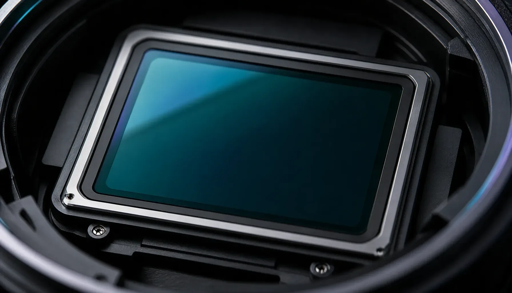
A digital sensor records light as digital image data. The camera then interprets that data through its processing pipeline to create a JPEG; a RAW file offers more scope for later interpretation. Neither is inherently a film scan. The film-like character must be introduced through tone, color and texture choices.
This is why a recipe should be treated as a rendering, not a change to the sensor itself. It can shape the image saved by the camera, but it cannot make the sensor respond exactly like a particular emulsion. The result also depends on the scene, exposure, white balance, lens and camera settings.
For a deeper explanation of the source image and rendering choices, see how to match analog film stock to digital sensor data.
Decide which qualities matter most
A useful target description is specific enough to guide decisions. For example: “soft color, restrained contrast, gentle highlight detail and visible but not dominant grain” gives you more to work with than “make it look vintage.”
Consider these components separately:
- Tone: How deep should shadows be? Should blacks remain dark or appear faded?
- Contrast: Should the image feel punchy, gentle or somewhere between?
- Color: Which hues should stay vivid, shift, or become more muted?
- Texture: Do you want subtle grain, pronounced grain or a clean image?
- Optics: Should the image retain modern sharpness, or feel softer and less clinical?
The right balance depends on the subject. A portrait may benefit from restrained color and gentle contrast, while a colorful city scene might suit a stronger palette. Matching the visual intent is more useful than chasing an exact numerical resemblance.
Choose the right workflow for the look
An in-camera recipe and a post-processing edit can both create a film-inspired rendering. The practical difference is where the look is applied and how much control you retain afterward.
 The Science of Emulation: How to Match Analog Film to Digital Sensors - What film emulation means—and why the sensor matters
Compare in-camera recipes with post-processing
In-camera settings are useful when you want the look baked into a JPEG and prefer to minimize editing. The available tools vary by system: Nikon Picture Controls can use .NP3 or .NCP files; Fujifilm cameras offer configurable film-simulation recipes; Sony cameras use Creative Looks, Picture Profiles or custom LUTs; and Ricoh, Panasonic Lumix and Canon provide their own image-style options.
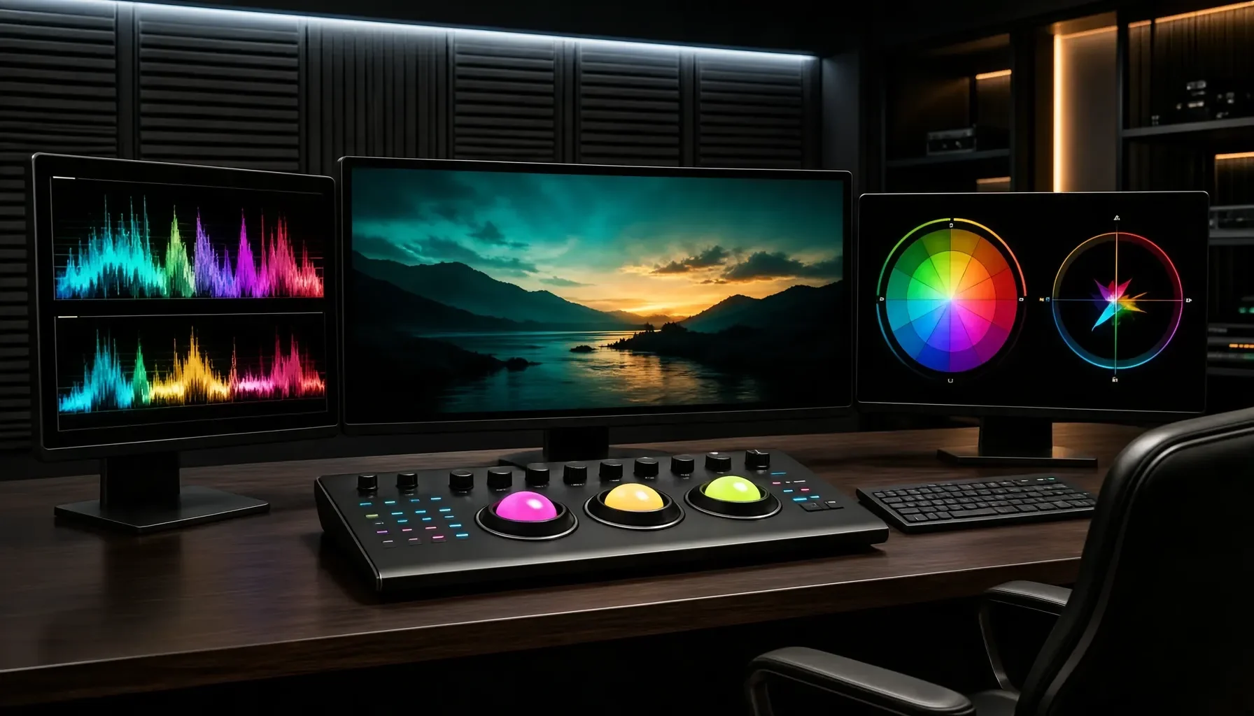
Post-processing gives you room to refine tone, color and texture after capture. For example, Lightroom can be used to lift the bottom of a tone curve, adjust color relationships and add grain. If you shoot RAW, you can make those choices later; a camera recipe is most directly useful when you want a ready-to-use JPEG.
Neither route is automatically more authentic. A well-chosen in-camera profile can be consistent and convenient, while a careful edit can be tailored to a particular scene. Many photographers use a recipe as a starting point, then make modest adjustments where a lighting condition or subject needs them.
Use the reference table to plan your approach
The table below connects common film-inspired goals with practical digital controls. Treat the settings as directions for experimentation, not as universal formulas: the same adjustment can behave differently across cameras, images and lighting conditions.
| Desired characteristic | Digital control to try | What to watch for |
|---|---|---|
| Softer shadow contrast | Lift the lower end of the tone curve | Avoid making the whole image look flat |
| Less dramatic overall contrast | Reduce contrast or soften the curve | Check that the subject still has clear shape |
| Gentle color in the shadows | Apply subtle blue, purple or red shadow tinting | Strong tinting can make neutral areas look artificial |
| Warmer, film-inspired palette | Shift oranges toward red and yellows toward orange | Check skin and other warm colors carefully |
| Muted greens and blues | Reduce saturation in those color ranges | Preserve enough color separation for the scene |
| Dreamier, softer atmosphere | Try negative Dehaze in Lightroom | Too much can obscure detail and reduce clarity |
| Visible image texture | Add grain, or use actual film-grain scans as overlays | Match grain visibility to image size and subject |
| More organic-looking in-camera texture | Test higher ISO on cameras whose noise is suitable | Noise is not identical to film grain |
| Less clinically sharp rendering | Try a vintage lens or a softening filter | Confirm that any loss of detail suits the image |
| Film-like video motion blur | Shoot at 24p or 23.98p with a 180-degree shutter, about 1/48s | This concerns motion rendering, not still-photo grain |
A balanced Lightroom grain starting point is often around 30/30/50 for Amount, Size and Roughness. Use it as a test rather than a required recipe; the right texture depends on the image and how it will be viewed.
Separate color, tone and texture decisions
When an image feels wrong, identify which part of the rendering is responsible. If the picture has the right palette but feels too harsh, adjust contrast rather than adding more color. If the tonal structure is pleasing but the image looks too polished, test texture or lens character instead of fading the blacks further.
This separation makes comparisons easier. Save a version before adding grain, then compare it at the intended viewing size. A texture that looks convincing when zoomed in may dominate a small image; conversely, subtle grain may disappear in a reduced JPEG.
Keep the original file when possible, especially when working from RAW. It provides a reference if a strong color shift or curve adjustment does not suit another scene.
A practical step-by-step matching workflow
A repeatable process helps you create a coherent film-inspired look without mistaking one image-specific adjustment for a universal recipe. Start with a clear visual target, then work from broad tonal decisions toward finer color and texture.
 The Science of Emulation: How to Match Analog Film to Digital Sensors - Choose the right workflow for the look
1. Define the reference and shooting conditions
Choose a film stock or visual reference, then describe the qualities you want to reproduce. Use a specific brief, such as “muted greens, restrained contrast and visible grain,” rather than a broad label such as “film look.”
Note the scene and the conditions that influence your result:
- Subject and dominant colors
- Available light and whether it is consistent
- Camera and intended output, such as JPEG or RAW
- Whether the image is a still photograph or video
- The viewing context, such as a screen or a larger print
This matters because a profile that works well for a portrait in soft light may not translate directly to a high-contrast street scene. Make the first comparison using similar lighting and subject matter where possible.
2. Establish exposure and tonal structure
Expose consistently before judging the look. If exposure changes between test frames, it becomes difficult to tell whether the difference comes from your recipe or from the amount of light recorded.
Begin with the tonal character. Adjust overall contrast, then decide whether to lift the darkest tones so they do not reach pure black. Faded blacks can suggest a softer or aged rendering, but lifting them too far can make shadows look gray and deprive the image of depth. Check highlights and midtones as well as the darkest areas.
Do not assume that softer contrast means lower visual clarity. A scene still needs enough separation between its subject and surroundings. Make small changes and compare the image with the unadjusted version.
3. Shape the palette with restraint
Once the tonal structure is close, work on color relationships. A film-inspired palette may involve shifting oranges toward red, moving yellows toward orange, or reducing the saturation of greens and blues. These are starting directions, not rules for every stock or scene.
Check the effect on recognizable colors. A warm shift that improves a sunset may make skin look too red; muted greens may help foliage feel less digital but also remove useful separation from a subject’s clothing. Subtle shadow tinting—such as blue, purple or red—can add atmosphere, but neutral surfaces are a good test for whether the tint has become too strong.
If the camera offers a suitable Picture Control, film simulation, Creative Look or Photo Style, build the rendering in-camera. For Nikon, .NP3 and .NCP Picture Controls are relevant formats; Film Recipe Hub’s free NP3 Generator can turn a reference photo into a Nikon Picture Control.
4. Add texture, then evaluate the complete image
Only add grain after tone and color are working. A common Lightroom starting point is Amount 30, Size 30 and Roughness 50, but these values are not a guaranteed match for a particular stock. Preview the result at a realistic viewing size and reduce the effect if the grain distracts from the subject.
For a more authentic texture, actual film-grain scans can be used as overlays rather than relying only on synthetic digital noise. In-camera, some photographers use higher ISO to introduce natural-looking camera noise, particularly with cameras whose noise pattern they like. This can be a practical choice, but digital noise and film grain are not interchangeable.
For video, the motion treatment is separate from the color treatment: 24p or 23.98p with a 180-degree shutter—about 1/48s—can approximate the motion blur associated with motion-picture film.
5. Test across scenes before calling it a recipe
A single successful frame does not prove that a look will work everywhere. Test the rendering on different subjects and lighting, especially if you plan to save it as a reusable camera recipe. Include skin, foliage, bright areas and shadows if those appear regularly in your work.
If the look breaks in one situation, identify the cause before changing everything. A color shift may be too strong for the scene; the exposure may differ; or the lighting may reveal a limitation in the recipe. Record the changes that help and keep the ones that consistently serve your intended style.
Avoid the common traps of film emulation
Convincing emulation is usually the result of controlled choices, not the accumulation of effects. Overusing fades, tints, grain or softness can make an image look processed without making it look more like the intended reference.
Do not treat “film look” as one preset
A grainy, aged Super 8mm appearance and a clean, high-contrast 65mm IMAX-inspired image are very different targets. The first may call for visible texture and a looser, more nostalgic feel; the second is not defined by heavy grain or faded blacks. Decide which kind of reference you mean before selecting adjustments.
Likewise, avoid trying to force every digital file toward the same stock interpretation. Different lighting and subjects can respond differently to a fixed color recipe. A useful preset creates a starting point; it does not remove the need to evaluate the image.
Keep imperfections purposeful
The appeal of film emulation often comes from imperfections, but more is not always more convincing. Heavy grain can compete with fine detail. Negative Dehaze can create a dreamy softness, but too much can make the picture look washed out. A strong shadow tint can make neutral objects appear colored.
Slight, intentional focus misses may contribute to an organic feel in some images, but they should not become a substitute for controlling focus. Similarly, vintage lenses such as a Helios 44M or Leica R lens can introduce optical character when adapted to a compatible camera, but their effects depend on the lens, scene and use. If a modern lens looks too clinical, a softening filter is another option; use either approach only when the loss of crispness helps the image.
Match grain and sharpness to the output
Texture is easiest to judge in context. Inspect grain at the size people will actually see the image, not only at maximum magnification. A treatment that feels balanced on a large display may become too prominent in a small JPEG.
Consider the camera and lens together. A smaller sensor, such as an iPhone sensor, may make it harder to reproduce the shallow depth-of-field appearance associated with a 35mm camera. That is a depth-of-field difference, not something a color profile can fully correct. Where depth of field is central to the reference, camera and lens choice matter alongside color grading.
Adapt the process to your camera and goals
The best workflow is the one that fits your camera, subject and preferred amount of editing. Build around the tools available to you rather than assuming every system can use the same file or reproduce the same effect.
If you want ready-to-use JPEGs
Use your camera’s supported image-rendering controls and test the result under the light you expect to encounter. Nikon users can work with Picture Controls, including .NP3 and .NCP files; Fujifilm users can configure film-simulation recipes; Sony users can explore Creative Looks, Picture Profiles or custom LUTs. Ricoh GR, Panasonic Lumix and Canon cameras also have dedicated image-style controls.
The details and compatibility vary by camera, so do not assume that a file or menu setting transfers unchanged between models. Start with the camera’s supported workflow, then test a sample image before relying on a recipe for an important shoot.
For a camera-specific look, begin with the relevant Nikon, Fujifilm, Sony, Ricoh, Lumix and Canon recipe collections. Film Recipe Hub publishes community recipes with sample photos and credits the original creator; use the sample images to judge whether the look suits your subject.
If you prefer to edit RAW files
A RAW workflow is useful when you want to adjust the rendering after capture. Work through tone, color and texture in a consistent order, and retain an unchanged source file so you can compare your edit with the original.
Treat Lightroom’s grain controls as one option, not the only route. Real film-grain scans can serve as overlays when you want texture that is not merely generated by the editing software. Keep the overlay subtle enough that it supports the image rather than drawing attention to itself.
You can also create a camera-ready version of a look after refining it. For example, the Lightroom-to-Nikon converter is relevant if you want to translate a Lightroom rendering into a Nikon Picture Control workflow. Always check the resulting file and camera compatibility rather than assuming every adjustment maps directly.
If you shoot portraits, landscapes or video
For portraits, pay close attention to skin when shifting warm colors or tinting shadows. A palette that looks pleasing in a landscape may push skin too far toward red or orange. For landscapes, test how reduced green and blue saturation affects foliage, water and sky; these colors can lose useful separation if muted indiscriminately.
For video, keep motion and color as separate decisions. A frame rate of 24p or 23.98p with a 180-degree shutter, about 1/48s, addresses motion blur; a Picture Profile, Creative Look or LUT addresses the rendering. For still images, the video shutter guidance does not apply.
Whatever the subject, avoid demanding a pixel-perfect match to an analog stock. Use the reference to guide a rendering that works with the digital file. Film Recipe Hub’s guide to matching film grain in Nikon Picture Control can help Nikon users think specifically about texture; compare its guidance with your own camera and output.
FAQ
Can a digital camera reproduce a specific film stock exactly?
No single camera recipe or edit can guarantee an exact reproduction of an analog stock. Digital image data and film do not respond identically, and the final appearance also depends on exposure, lighting, lens, processing and output. A more practical target is to reproduce selected traits—such as contrast, color relationships and grain—while making an image that works well on its own.
Should I use a camera recipe or edit the image afterward?
Use an in-camera recipe when you want a film-inspired JPEG straight from the camera and prefer less editing. Choose post-processing when you want to refine tone, color and texture after capture, particularly from RAW files. You can also combine the approaches: use a camera rendering as a starting point, then make restrained adjustments. The best choice depends on your camera, workflow and how much flexibility you want.
Is digital noise the same as film grain?
No. Digital sensor noise can add texture, and photographers may deliberately use higher ISO when they like the camera’s noise pattern. But noise is not identical to film grain. For a grain treatment based on real film texture, scanned film grain can be used as an overlay. In either case, judge the result at the size where the final image will be viewed and keep texture in proportion to the subject.
What should I adjust first when an image does not look film-like?
Start by checking the reference and the image’s tonal structure. Decide whether the main problem is contrast, color or texture before making changes. If the picture looks too harsh, work on contrast or the tone curve; if the palette is wrong, adjust color relationships; if the image feels too polished, test grain or optical softness. Changing one category at a time makes it easier to understand what actually improves the result.